In-Depth Guide to Designing for Variable Data Printing
 Image Source
Designing for Variable Data Printing (VDP) demands a sophisticated approach that considers layout, fonts, images, and color choices. The goal is to ensure that each piece not only looks professional but also resonates personally with each recipient. Here we delve deeper into each component with expanded details to guide your design process effectively.
 Image Source
Detailed Layout Design for Variable Data Printing
Creating an adaptable layout is essential in Variable Data Printing, as it must seamlessly accommodate variable content lengths and formats without compromising design quality.
Adaptive Layouts
- Flexibility is Key: Design layouts that are inherently flexible, allowing text blocks and image areas to expand or contract. This approach ensures that the design remains visually appealing regardless of the length or size of the variable data.
- Modular Design: Employ a modular design strategy where components such as text boxes, images, and other graphic elements can be rearranged or resized. This modular approach ensures that variations in content do not disrupt the overall layout or flow of the document.
Content Hierarchy
- Establish Visual Flow: Design with a clear visual hierarchy that prioritizes information, using typography, color, and placement to guide the viewer’s eye through the content effectively, regardless of changes in the data.
- Maintain Balance: Strive to keep the overall design balanced. This involves thoughtful placement and sizing of text and images to ensure the layout remains aesthetically pleasing even as elements shift or change size based on personalized content.
 Image Source
Selecting Fonts for Variable Data Printing
The choice of fonts can greatly affect both the look and functionality of VDP projects, making it crucial to select styles that are both versatile and visually engaging.
Legibility Over Style
- Simplicity Works Best: Opt for fonts that are straightforward and easy to read at various sizes. Sans-serif fonts are generally preferred for smaller text due to their clarity and modern appearance.
- Consistent Font Families: To maintain a cohesive look across various print pieces, limit the number of font families used. A single family with multiple weights and styles can provide sufficient variety without sacrificing consistency.
Font Flexibility
- Responsive Sizing: Design text elements with fonts that can adjust in size without losing legibility. This is particularly important in VDP, where text length can vary. Avoid fonts that become illegible when scaled down or appear overwhelming when scaled up.
- Avoid Overflow: Construct text areas to accommodate an increase in volume by approximately 10-20%. This buffer helps prevent text from spilling over or being cut off, which can detract from the design’s effectiveness.
 Image Source
Utilizing Images Effectively in Variable Data Printing
Images in VDP need to be flexible and high quality to adapt to various sizes and formats without diminishing the overall impact.
Image Quality and Scalability
- High Resolution is Critical: Use only high-resolution images, with a minimum of 300 dpi, to ensure that they remain crisp and clear in print, even when resized or altered.
- Aspect Ratio Flexibility: Select images with a central focal point that allows for flexible cropping. This adaptability is crucial in VDP, where image sizes and aspect ratios might vary between prints.
Dynamic Image Placement
- Smart Image Containers: Develop intelligent containers for images that can dynamically adjust to different sizes and aspect ratios. This flexibility helps maintain the layout’s integrity and ensures images integrate smoothly with variable data.
- Test Different Scenarios: It is beneficial to simulate several variations during the design phase to ensure that images maintain their visual appeal in different placements and sizes across the print run.
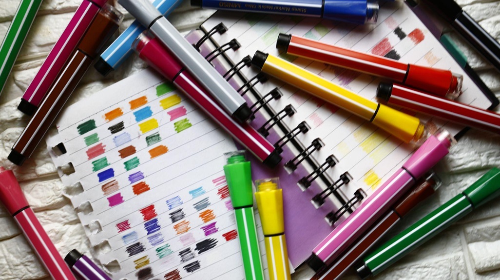 Image Source
Color Strategy in VDP
Color choices in VDP should reinforce brand identity and enhance the visual attractiveness of the print pieces.
Consistent Brand Colors
- Brand Recognition: Employ consistent brand colors throughout all variations to reinforce the brand identity. This consistency helps in maintaining a professional and cohesive look across different pieces.
- Contrast and Visibility: Ensure there is significant contrast between text and background colors, especially when the text color may vary with different iterations. This contrast is crucial for readability and visual impact.
Adaptable Color Schemes
- Complementary Palettes: Develop a secondary color palette that complements a variety of images and text colors. This approach allows for a harmonious design regardless of the variations in the data.
- Pre-testing: Conduct pre-testing on different printers and paper types to see how colors render physically. Digital previews can sometimes be misleading, and physical tests help ensure accuracy.
PRO TIP: Consistently applying a well-considered color scheme can enhance brand recognition by up to 80%, making it a critical component of effective VDP design. These expanded guidelines and tips are designed to help you navigate the complexities of Spectra VDP design, ensuring that each project is not only visually appealing but also maximizes the potential of personalized print communications.